4.5 KiB
4.5 KiB
🡔 Layout
Layout grid
Align items both vertically and horizontally. You can either specify the column width (default: 320px) or set the desired number of columns.
Override the column-width (in px)
Note that we set the width to match 2 columns plus one gap.
<Layout grid
  column-width="90px"
  :width="`${2 * 90 + 32}px`"
>
  <Alert yellow />
  <Card auto title="90px" />
  <Alert blue />
</Layout>
Let elements span multiple rows, columns, or areas
  <Alert purple style="grid-column: span 5;" />
  <Alert green style="grid-row: span 2;" />
  <Card title="2"/>
  <Card title="1" />
You can also span an element to a rectangle of multiple columns and rows, in the format <row-start> / <column-start> / <row-end> / <column-end>:
<Layout grid="auto / repeat(5, min-content)">
  <Card auto title="A" />
  <Card auto title="B" />
  <Card auto title="C" />
  <Card auto title="D" style="grid-area: 2 / 1 / 4 / 5;" />
  <Card auto title="E" />
  <Card auto title="F" />
  <Card auto title="G" />
  <Card auto title="H" />
  <Card auto title="I" />
</Layout>
Custom grid configuration
You can pass any valid CSS grid value to the grid prop.
Minimal width, fit as many as possible on one row
<Layout grid="auto / repeat(auto-fit, minmax(max-content, 200px))">
  <Alert green />
  <Alert red>Very long text that will force other items to wrap</Alert>
  <Alert blue />
  <Alert yellow />
  <Alert purple />
</Layout>
Up to 2 in a row, between 230-x and 300px
<Layout no-gap
  grid="auto / repeat(auto-fit, minmax(230px, min(50%, 300px)))"
Up to 5 in a row, between 230-x and 300px
<Layout no-gap
  grid="auto / repeat(auto-fit, minmax(120px, min(20%, 130px)))"
As many as fit, at least 100px, stretch them if necessary
<Layout
  grid="auto / repeat(auto-fit, minmax(100px, 2fr))"
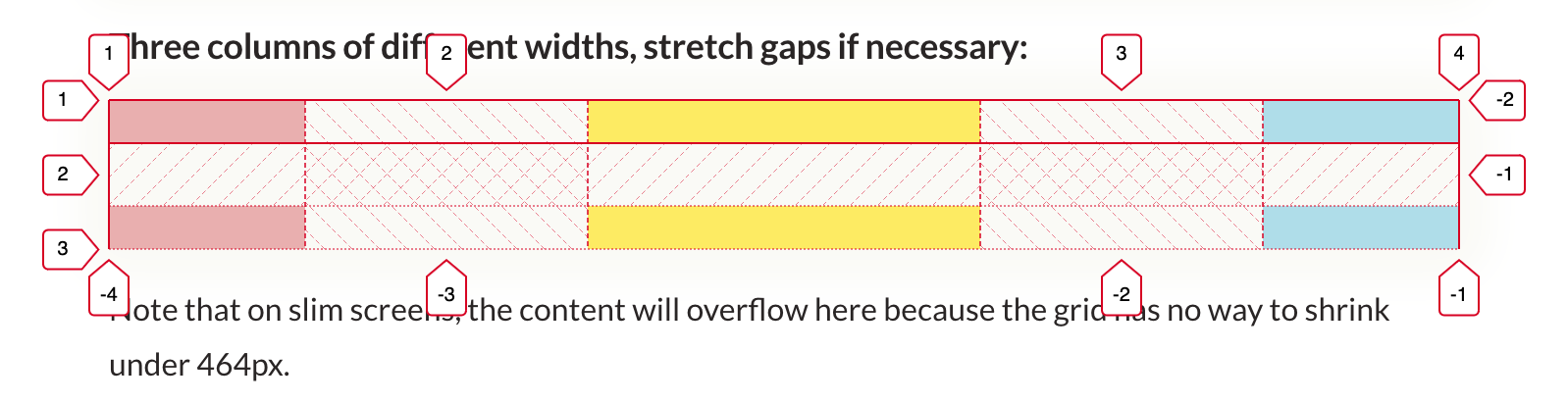
Three columns of different widths, stretch gaps if necessary
<Layout
  grid="auto / 100px 200px 100px"
  style="justify-content: space-between"
Note that on slim screens, the content will overflow here because the grid has no way to shrink under 464px.
Debugging Layouts
The browser's devtools can visualize the components of a grid.
And read the illustrated overview of all grid properties on css-tricks.com.