6.8 KiB
6.8 KiB
Designing Pages
Grid
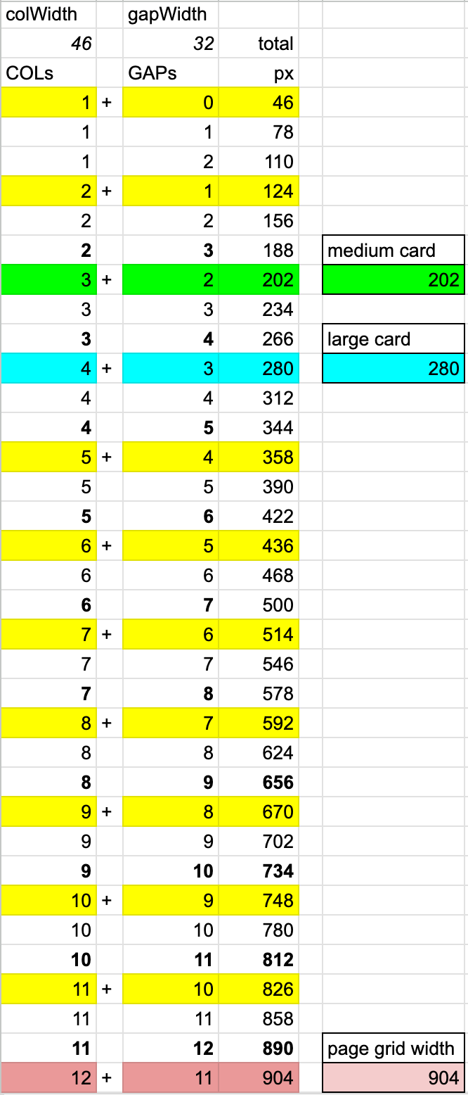
::: details Default widths
:::
The page grid consists of 46px wide tracks, separated by 32px wide gaps.
Responsivity
- Cards and Activities snap to the grid columns. They have intrinsic widths, expressed in the number of columns they span. For Card, it is 3 and for Activity, it is 4.
- On a typical laptop screen, you will have 4 albums or 3 activities side-by-side. On a typical mobile screen, you will have 1 medium card or 2 small ones in a row.
- The remaining space is evenly distributed.
- Title rows align with the content below them.
Resize the window to observe how the items move.
<Layout grid="auto / repeat(auto-fit, calc(46px * 3 + 32px * 2))" v-bind="attributes"
<!-- The title row's width is a multiple of 3 rows -->
<Layout flex no-gap
    style="grid-column: 1 / -1; align-self: baseline;"
>
    <!-- Set distance between baseline and previous row -->
    <Spacer v
        :size="64"
        style="outline:1px solid red; align-self: baseline;"
    />
    <!-- Flexible row content -->
    <!-- Note that the `h3` uses its padding to create the 24px bottom gap -->
    <h3 style="align-self: baseline; padding:0  0 24px 10px; margin:0;">
        Albums
    </h3>
    <Spacer grow />
    <Button ghost thin auto align-self="baseline"
        style="grid-column:-1;"
    >
        Show all
    </Button>
</Layout>
<Layout grid="auto / repeat(auto-fit, calc(46px * 4 + 32px * 3))" v-bind="attributes"
<Layout flex no-gap
    style="grid-column: 1 / -1; align-self: baseline;"
>
    <!-- Set distance between baseline and previous row -->
    <Spacer v
        :size="64"
        style="outline:1px solid red; align-self: baseline;"
    />
    <!-- Flexible row content -->
    <!-- Note that the `h3` uses its padding to create the 24px bottom gap -->
    <h3 style="align-self: baseline; padding:0  0 24px 10px; margin:0;">
        Tracks
    </h3>
    <Spacer grow />
    <Button ghost thin auto align-self="baseline"
        style="grid-column:-1;"
    >
        Show all
    </Button>
</Layout>
Navigation
When most of the screen changes, users perceive it as a page navigation. They will expect the "back" button to bring them to the precious screen. In addition, they may expect the URL to contain the current page for sharing.
This makes a component a "page". In this sense, modals are pages.
Not everything we want to share with the Url replaces most of the screen. What about switching a filter?