# Designing Pages
## Grid
::: details Default widths
:::
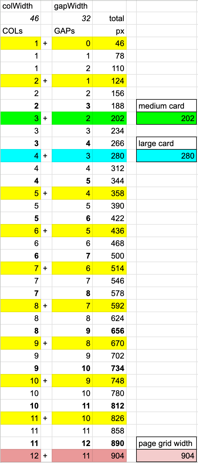
The page grid consists of 46px wide tracks, separated by 32px wide gaps.
### Responsivity
- Cards and Activities snap to the grid columns. They have intrinsic widths, expressed in the number of columns they span. For Card, it is 3 and for Activity, it is 4.
- On a typical laptop screen, you will have 4 albums or 3 activities side-by-side. On a typical mobile screen, you will have 1 medium card or 2 small ones in a row.
- The remaining space is evenly distributed.
- Title rows align with the content below them.
Resize the window to observe how the items move.
Click Toggle to left-align the layout.
---
Albums
Artist Name
13 tracks
Artist Name
13 tracks
Artist Name
13 tracks
Artist Name
13 tracks
Artist Name
13 tracks
Tracks
## Navigation
When most of the screen changes, users perceive it as a page navigation. They will expect the "back" button to bring them to the precious screen. In addition, they may expect the URL to contain the current page for sharing.
This makes a component a "page". In this sense, modals are pages.
Not everything we want to share with the Url replaces most of the screen. What about switching a filter?